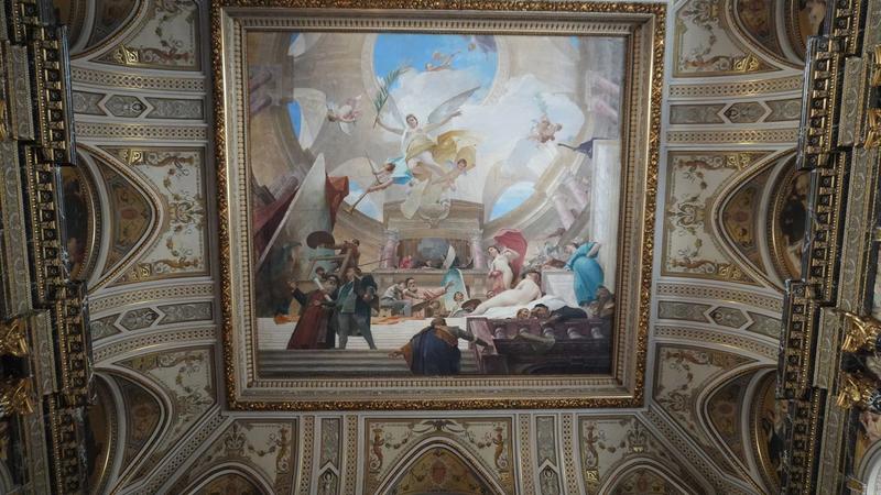
Many people enter a museum with an unspoken worry: that art will make sense only after they learn the right names, dates, movements, and symbols. Labels can help, but they are not a prerequisite for having a serious encounter with a work of art. A painting is already making choices in plain sight—about scale, color, materials, attention, space, and mood.
The most useful first skill is not decoding a secret message. It is separating observation from interpretation. Before asking what a painting means, ask what is visibly there and how its parts work together. Museum educators often begin this way: give viewers time to look, describe visual evidence, then build toward questions about process, context, and possible meanings. ([82nd-and-fifth.metmuseum.org](https://82nd-and-fifth.metmuseum.org/learn/educators/lesson-plans/~/media/Files/Learn/For%20Educators/Learning%20Resources/MMA_AfricanArt_TG.pdf?utm_source=openai))
This guide offers a repeatable method for a museum visit, an exhibition catalog, or an image on a screen. It will not produce one final, universally correct reading. Instead, it gives you a way to form interpretations that are personal, specific, and answerable to the artwork itself.
Start before you read the label
Give the work a short stretch of undivided attention—perhaps 60 to 90 seconds—before looking for the artist’s name or the wall text. At first, do not try to sound insightful. Inventory the scene. Is it crowded or spare? Bright or dim? Still or energetic? Are there people, objects, marks, words, or empty areas?
This pause matters because labels can quietly decide what viewers believe they are supposed to notice. Starting with your own evidence does not mean rejecting scholarship. It means arriving at the scholarship with questions of your own. The National Gallery of Art recommends looking first at what is actually visible, then moving toward questions and interpretations; it also encourages viewers to support claims with the evidence that prompted them. ([nga.gov](https://www.nga.gov/educational-resources/afro-atlantic-histories-teaching-tips?utm_source=openai))
- Try: “I notice three figures near the edge,” rather than “This is about loneliness.”
- Notice your first physical response—restlessness, calm, unease, delight—but treat it as a clue to investigate, not a verdict.
- If you are with someone, compare observations before comparing opinions. You may discover that you were looking at different parts of the same image.
Follow the artist’s steering wheel
Composition is the arrangement that directs your attention. A painting can lead your eye with a bright patch, a face turned toward another figure, a road narrowing into the distance, repeated shapes, or a sharply angled line. Trace your route through the work: Where do you look first? Where do you go next? What keeps pulling you back?
Then ask what the arrangement makes possible. A centered figure can feel monumental, exposed, or formally controlled. A figure pushed to the edge can suggest movement beyond the frame, imbalance, or an intentionally incomplete view. None of these effects is automatic; the point is to connect a visual choice to a plausible experience.
Basic visual elements supply useful language here. The National Gallery of Art identifies color, line, shape, form, and texture as core elements artists use in different combinations. You do not need a large technical vocabulary. A few accurate words, used carefully, are more valuable than a long list of art terms. ([nga.gov](https://www.nga.gov/educational-resources/elements-art?utm_source=openai))
- Line: Are marks smooth, jagged, heavy, faint, looping, or directional?
- Color: Do hues create contrast, harmony, heat, distance, or a particular time of day?
- Space: Does the painting invite you in, flatten the scene, or make the room feel unstable?
- Scale: What seems deliberately enlarged, reduced, cropped, or left out?
Surface changes the meaning of an image
A painting is not only an image of something. It is also a made object. Step closer when the museum permits, then step back again. From a distance, an area may look like a soft cloud or a convincing face. Up close, it might be built from dry strokes, thin stains, thick ridges, scratches, or layers that barely conceal one another.
These material decisions affect meaning. Thick, assertive paint can make a subject feel present and bodily; a thin wash can make an image seem fleeting or atmospheric. A carefully polished surface may suppress the evidence of labor, while visible brushwork can make the act of painting part of the subject.
Technique is also a reminder that what appears natural was constructed. Museum conservation research can reveal underdrawings, altered compositions, and the particular materials used in a work. Such findings can deepen an interpretation, but ordinary looking already begins with the same productive question: how was this effect made? ([metmuseum.org](https://www.metmuseum.org/de/perspectives/scientific-research-at-the-met?utm_source=openai))
- Look for areas where paint is thick enough to catch light.
- Compare edges: are they crisp, blurred, broken, or unexpectedly unfinished?
- Ask whether the material treatment changes from one area to another—and why that contrast might matter.
Context arrives after the first encounter
Once you have formed a visual account, read the label. Look for the artist, title, date, medium, place of production, original purpose, and any account of the work’s history. Context can correct an assumption, reveal a reference you could not reasonably know, or clarify why a material or subject mattered at a particular moment.
But context should expand looking rather than replace it. A title may direct attention toward a story, a sitter, a religious tradition, a political event, or an invented world. It does not erase what the painting visibly does. If your experience and the label seem to clash, return to the work. What evidence supports each reading? Is the label supplying historical information, while you are describing an emotional effect? Both may be relevant.
The Met’s teaching guidance describes a useful sequence: begin with visual analysis, consider artistic choices such as composition, scale, function, and medium, then examine the circumstances that shaped production. This order protects viewers from treating history as a substitute for attention. ([82nd-and-fifth.metmuseum.org](https://82nd-and-fifth.metmuseum.org/learn/educators/lesson-plans/~/media/Files/Learn/For%20Educators/Learning%20Resources/MMA_AfricanArt_TG.pdf?utm_source=openai))
- Use labels to answer factual questions, not to outsource every judgment.
- Distinguish an artist’s documented intention from a later interpretation.
- Remember that a work can hold more than one meaning across different audiences and periods.
Turn impressions into an argument
A strong response to art does not need to be academic, but it should be testable. Replace “I like it” or “It feels sad” with a claim that names both an effect and its visual cause. For example: “The painting feels tense because the figures are pressed into a shallow space, and the diagonal lines keep interrupting the calm horizontal table.”
This approach leaves room for disagreement. Another viewer may find the same compressed space intimate rather than tense. The productive question is not who has the authorized feeling; it is whether each person can point to features in the work that support the claim. The Met’s education work emphasizes trusting observation and making connections from visual elements before adding wider art-historical context. ([metmuseum.org](https://www.metmuseum.org/perspectives/looking-to-connect?utm_source=openai))
You can use a compact three-sentence format whenever a work feels difficult: describe one feature, explain its effect, and pose one unresolved question. Curiosity is not a failure to understand. It is often the beginning of understanding.
- Description: “The brightest color appears only in the lower corner.”
- Effect: “That small bright area keeps pulling attention away from the central figure.”
- Question: “Is the artist making the apparent subject less stable than it first seems?”
Final thoughts
Looking closely is a practical habit, not a credential. Begin with what you can see, follow the organization of the image, attend to the physical surface, and bring in context after you have something of your own to test against it.
The goal is not to solve every painting. It is to make your time with it more active. A memorable museum visit may come from one work you studied carefully—not because you mastered its definitive meaning, but because you learned to notice how it was asking to be seen.
Sources
Photo by АНАТОЛИЙ on Pexels.