A painting’s color is never just a list of reds, blues, and greens. What viewers experience as a brilliant yellow, a shadowy violet, or a glowing patch of water is produced by a collaboration among materials, light, neighboring colors, surface texture, and the visual system. Learning to notice that collaboration can make even a familiar painting more absorbing.
This does not require memorizing a color wheel or knowing the names of historic pigments. It means asking a few better questions: Is this color actually light or dark? What sits beside it? Is it mixed smoothly, layered transparently, or broken into separate marks? And how might the room’s illumination be changing what reaches your eyes?
Color begins with reflected light
Color is not a fixed substance residing unchanged inside an object. In ordinary viewing, light strikes a painted surface, the surface absorbs some wavelengths and reflects others, and the eye and brain interpret the reflected light. A blue passage in a painting therefore depends both on the paint and on the illumination falling on it. Move the same work from daylight to a warm, dim interior, and its relationships can appear different.
That basic fact explains an apparent paradox in painting: an artist can make a night scene feel luminous without using much white, or make an expanse of snow look colorful rather than simply blank. The effect comes from relationships. A relatively pale blue may read as radiant when surrounded by deep, muted tones; a small warm note can imply a shaft of late-day light when placed within cooler passages.
Claude Monet’s repeated studies of Rouen Cathedral offer a useful demonstration. The architecture remains broadly consistent, but changes in weather and time lead him to organize the façade through markedly different color and value relationships. The subject is not merely the building; it is the visual event created by atmosphere, light, and looking. ([nga.gov](https://www.nga.gov/educational-resources/elements-art/elements-art-color?utm_source=openai))
Brightness is not the same as a light color
One of the most useful distinctions for looking at art is between value and saturation. Value describes relative lightness or darkness. Saturation refers, more loosely, to how intense or muted a color appears. A pale gray can be very light in value but subdued; a dark crimson can be low in value yet feel strikingly intense.
Painters use this distinction to guide attention. A face may emerge because it is lighter than the surrounding field, because a warm note is more saturated than the colors around it, or because both conditions occur at once. Conversely, an artist may mute much of a composition so that one concentrated accent—a red scarf, yellow window, or turquoise reflection—does more visual work.
This is why it helps to squint at a painting or view a small reproduction from farther away. Fine detail recedes, while the larger arrangement of lights and darks becomes clearer. Then look again at normal distance and ask whether vivid color reinforces that structure or deliberately disrupts it.
- Value asks: where are the lightest and darkest areas?
- Saturation asks: which colors look most pure, and which look grayed, earthy, or restrained?
- Temperature asks: do colors lean comparatively warm or cool in this particular image?
Neighboring hues change what the eye sees
Colors do not appear in isolation. A gray placed beside orange may seem bluish; the same gray next to blue may seem warmer. This context effect, often called simultaneous contrast, gives painters a way to make colors appear more active without necessarily changing the paint mixture itself.
Complementary pairings are a familiar example. On a traditional painter’s color wheel, red and green, blue and orange, and yellow and violet sit opposite one another. When positioned side by side, they can intensify each other perceptually. The result may feel like a flicker, a vibration, or a sharp edge of light. The colors have not literally become brighter, but their contrast makes them seem more forceful.
This principle is especially useful when viewing Impressionist and Neo-Impressionist work. Rather than blending every transition into a uniform surface, painters could place small, distinct touches of color close together and allow the viewer’s perception to participate in the mixture. National Gallery of Art teaching materials describe the Neo-Impressionist ambition as an optical mixture of separate marks, informed by nineteenth-century investigations of color and light. ([nga.gov](https://www.nga.gov/educational-resources/sense-place-france/monets-waterscapes?utm_source=openai))
Pigment and light follow different rules
It is tempting to treat a paint palette and a phone screen as versions of the same system. They are not. Paint mixing is principally subtractive: pigments absorb portions of the light that falls on them, so adding more pigments commonly produces a darker, duller mixture. Mixing colored light, as on a display, is additive: combining light can increase the light reaching the eye.
The distinction clarifies why an artist may preserve separate blue and yellow strokes instead of physically mixing a green. On the palette, the mixture can lose some freshness. On the canvas, closely placed marks may retain their individual liveliness while suggesting a blended effect at viewing distance. This is not a universal recipe for better painting—many artists want dense, mixed, earthy color—but it is a deliberate choice with visual consequences.
Older classroom color models are useful starting points, not complete scientific maps of every pigment available today. What matters most while looking is practical: observe whether colors are physically blended, optically suggested through separate marks, or made to interact across an edge. ([nga.gov](https://www.nga.gov/educational-resources/elements-art/elements-art-color?utm_source=openai))
The surface can make color move
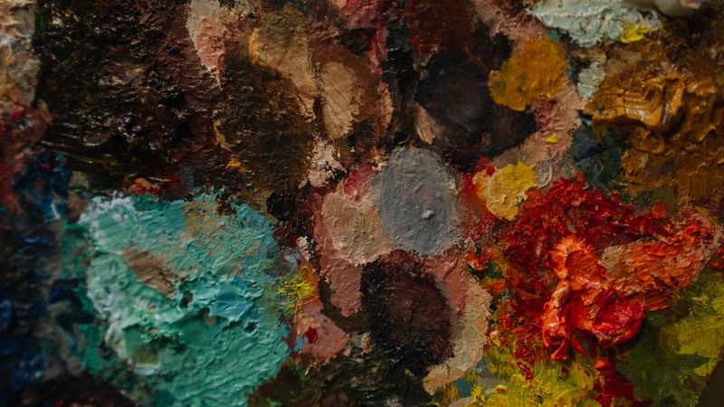
A painting is also a physical object, and its surface changes the experience of color. Thin paint can let a ground or earlier layer influence the final appearance. Transparent glazing—a translucent layer applied over dried paint—can alter color while maintaining a sense of depth. Thick, ridged paint catches light differently across its peaks and valleys, making a passage look more present and materially assertive.
Brushwork matters as well. A soft blend can suggest haze, skin, smoke, or gradual illumination. Dry-brush marks can leave broken, scratchy traces that activate the texture beneath. Wet-on-wet painting allows colors to merge quickly on the surface, while sgraffito reveals a contrasting layer by scratching through the upper paint. These are not merely technical signatures; they determine whether color reads as air, fabric, stone, weather, or movement. ([nga.gov](https://www.nga.gov/educational-resources/explore-basics-painting?utm_source=openai))
A practical museum habit follows from this: change your distance. Stand back to see the overall color structure. Step closer to find separate strokes, exposed underlayers, and changes in thickness. Then return to a middle distance, where the artist’s intended balance between marks and image often becomes most apparent.
Time can change the palette
The colors visible today are not always exactly those an artist first saw in the studio. Pigments and binders can alter through exposure to light, air, moisture, or chemical reactions; varnishes may yellow; restoration choices can also affect appearance. Conservation research documents that some changes are subtle, while others can substantially shift a painting’s color relationships.
This does not mean historic paintings are unreliable evidence of artists’ intentions. It means that looking at them involves history as well as vision. Conservators study materials, compare technical evidence, and distinguish stable passages from vulnerable ones. Knowing that a brilliant blue may have shifted toward green, or that a faded lake pigment may once have been stronger, adds another layer to the encounter: color has a biography. ([nga.gov](https://www.nga.gov/research/publications/facture-vol-7-change/pigment-alteration-and-color-change?utm_source=openai))
Final thoughts
To understand color in painting, look beyond color names. Notice value before hue, compare each passage with its neighbors, and pay attention to whether paint is blended, layered, or left in separate marks. Consider the lighting in the gallery and the physical surface of the work.
The reward is a more active kind of looking. Color stops being decoration applied after the fact and becomes one of painting’s main tools for constructing space, directing attention, recording atmosphere, and making a still surface feel unexpectedly alive.
Sources
Photo by Mikhail Nilov on Pexels.